
When you learn Excel, in time, you want to learn more ways for visual sides. Such as creating data charts and one way to start is learning to create a bar chart in Excel. You may wish to show data in a better way or simply want to learn how to create a bar chart.
Table of Contents
Ok, if you want examples for bar chart things, you may want to track your company’s sales growth over time. Also you can compare the performance of different products. So, creating a bar chart in Excel can help your presentations for managers or clients. It is like the beginning of creating charts and you can go for a bar chart at first.
Insert a bar chart in Excel spreadsheet
In case you want your excel data more visually appealing and easy to understand, you can go for it. Bar charts are one of the most popular ways to these tough. And Excel has several menu options to create them in a few moves.
So, How to insert a bar chart in Excel: create a bar graph
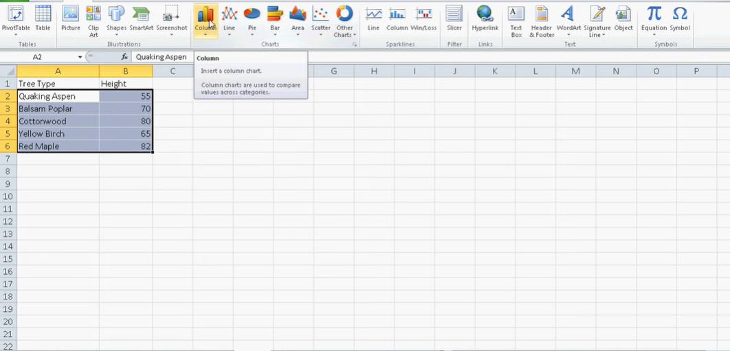
1. As always, you should select the data you will be working.
2. Then, you will click the Insert tab on top Ribbon.
3. Then in order to specify your chart type, you should click Bar from the Chart group.
4. Here Excel will help you by offering different bar chart options. So, you will select the type of bar chart you liked.
5. Excel will insert the bar chart into your spreadsheet.
6. You can customize the chart’s appearance by selecting different options in the same menu.
How to use Bar Graph in Excel?
Bar charts are a great way to visualize data and they are even ideal for beginner users. They are easy to create and can be customized for your style.
Add a trendline to the data series: How to Make a Bar Graph in Excel
What is better news, you can customize the chart to make it more visually appealing. Excel offers a variety of options for doing this. For example, you can change the fill color or pattern, border color and other options to change the bar’s look. And also, you can add or remove data series from the chart by selecting or deselecting them. In this way, you can have multiple bar charts with different axis.
bar chart in Excel Examples
For example, you can change the scale of the axis or reverse the axis. In this way, that large values will be on the bottom and small values are on top.
Moreover, bar charts can fit everyone’s need. If you are learning it recently, you can go with Excel recommendations and select the most basic one. But in time, you can create different and more colorful bart chart in Excel.
Export the BC as a PDF or image file: making a bar graph with excel
When you are done with creation steps, you can format your bar chart to make it more professional looking. To do this, you can click on the chart and the Format tab at top. From here, you can change the colors of the bars, add or remove gridlines. And even you can make other changes to the appearance of the chart.
It is also possible to change the data labels and titles on the chart. If you wanna change labels or add one, you can click on the chart and then click the Chart Elements button. In the next menu,you can check or uncheck the boxes next to Data Labels and Title.
bar diagram in excel
In case you want to upgrade you chart and tell more things to audience, you can also add a trendline to the data series. This trendline will show the overall direction of your data. If you wanna add one of them, you will click on the chart and the Chart Elements again. In the same menu, you can check the box next to Trendline to add it to the chart.
Conclusion
After reading these, you may agree with us how Excel makes it easy to create a bar chart. You can insert a bar chart into your spreadsheet with just a few clicks. In case we need to summarize, first step is selecting the data for the chart. Then, you will click Insert tab on the Excel ribbon and you go for Bar option.
Here in drop down menu, you can select the type of bar chart and Excel will then automatically convert your data into a bar chart.
making a bar chart in excel
Once you are finished with bar chart, good news is you can export it as a PDF or image file. If you wanna get a PDF version, you will click on the chart and then click File on top ribbon. Now, you can click Save As and choose either PDF or image format.
making a bar chart in excel
Creating a bar chart in Excel is a quick and easy with these Excel options at your hand. With just a few clicks, you can insert a bar chart into your file or ppt and format it to look professional. You can also change the data labels and titles as well as add a trendline to highlight something. So whether you need to track your company’s sales growth over time or you want to compare the performance of different products, Excel bar charts can create basic or complicated visuals for you.

A dedicated Career Coach, Agile Trainer and certified Senior Portfolio and Project Management Professional and writer holding a bachelor’s degree in Structural Engineering and over 20 years of professional experience in Professional Development / Career Coaching, Portfolio/Program/Project Management, Construction Management, and Business Development. She is the Content Manager of ProjectCubicle.