Ok, you are already familiar with Excel charts so far but you want to create an area chart in Excel tutorial? Because these chart a bit different than basic ones. And they can visualize data over time or compare values between different categories. So what are the steps of creating an area chart? We will highlight some key features along the way and then, you can create eye-catching visuals to tell your message.
Table of Contents
What is an area chart and What is the area chart used for?
An area chart shows data points connected by line segments. Also, these area charts visualize data over time or compare values between different categories.
One key difference between an area chart and other types of charts is these charts emphasizes quantity rather than order. It especially works when you are visualizing data with many values.
How to create an area chart in Excel?
So, if you wanna start your first area chart, you can follow these steps to create an area chart in Excel:
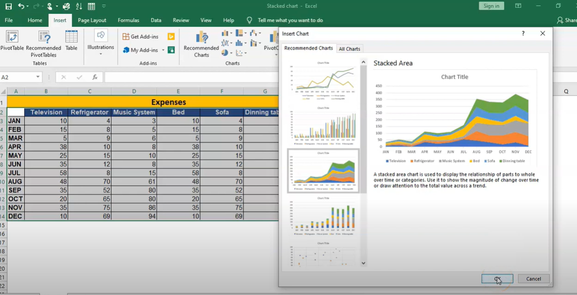
1. First, you should select the data for chart.
2. Then, you need to click the Insert tab on the ribbon and then click Area in the Charts section.
3. Now, you can choose the type of area chart you want to create.
4. And only thing left to do is clicking on insert.
And that’s it, your area chart will now appear on the worksheet.
Key features of an area chart: how to create chart with excel
There are a few key features to consider when working with area charts. These charts are useful for visualizing data over time or comparing values across different categories. Because they emphasize quantity rather than the order of the data. So they are so ideal for seeing overall trends.
what is an area graph
In Excel, you can start using them by selecting the relevant data and choosing the area chart type from the Charts section. After inserting an area chart, it is possible to customize it further by adding titles, labels and other elements. So you will enhance its clarity and effectiveness.
With this guide, you now have an idea of how to create an area chart in Excel. So why not using it today?
How to create an area chart in Excel: excel area chart
Creating an area chart in Excel is a great way for showing overall trends in a subject such as sales over a year. Because here the chart focuses on quantity.
1. Ok, you will open up your Excel file and select the data you want.
2. Then you will find the Insert tab and click on Area Chart.
3. In this menu, you can see different types of area charts. Based on what you like and need, you can select the one you want to use and click OK.
There are a few things to keep in mind when creating an area chart in Excel:
- Yes it can be created in 3 clicks but before that you should ensure your data is in columns or rows. Because area charts work best with this format.
- If you want to compare values over time, we recommend to use a line chart instead. Area charts are best for comparing categories.
- When choosing a color scheme, you may avoid using colors in similar tones because it can worsen your graph in PPT presentations or in meetings.
Creating an area chart in Excel is a great way to visualize your data when making presentations to clients or managers. With just a few clicks, you can create visually appealing charts. So your audience can engage with the content and understand your message better.
Tips for formatting and styling your area graph excel
Ok first tip is sticking to a consistent color scheme really helps with readability. Also when there is lots of data, thicker lines can make it easier to see.
Adding a title and labels for the axes gives viewers a better understanding of what they are looking at exactly. If your data covers a wide range, a logarithmic scale might be worth trying because otherwise it can be a bit messy. We can also suggest annotating data points. Because these add extra insights and highlights important info. And at the end, you can export this chart as image and use in PPTs or in emails and send away easily.
Examples of how to use an area chart in business or personal projects: what is an area graph?
1. Comparing sales data over time
2. Track website traffic by month
3. Seeing changes in stock prices
4. To show the growth of a population over time
5. Comparing performance of different teams or departments
6. To monitor your website’s search engine ranking over time
Creating an area chart in Excel is a quick and easy way. You can follow the steps in this tutorial to learn how you can use it for your benefit. With a few clicks, you can create best in class charts.
Conclusion
Charts are a great way to communicate data visually. They can help you quickly and easily compare values between different categories, or visualize data over time. This guide will show you how to create an area chart in Excel. This chart type perfectly shows how a value changes over time or compares values between different groups. If you read another Excel tutorial article, please click the article!

A dedicated Career Coach, Agile Trainer and certified Senior Portfolio and Project Management Professional and writer holding a bachelor’s degree in Structural Engineering and over 20 years of professional experience in Professional Development / Career Coaching, Portfolio/Program/Project Management, Construction Management, and Business Development. She is the Content Manager of ProjectCubicle.