Combo chart Excel help us to combine 2 or more chart types in a single chart. This helps you better represent and visualize your data. Here this article we will cover everything you need to know about combination charts in Excel. For instance, how to create them to the best practices for using them.
Table of Contents
What are Combination Charts in Excel?
Combination charts are also known as combo charts. And these are a type of chart to combine 2 or more chart types in a single chart. For example, you can create a chart that combines a column chart with a line chart. Or a bar chart with a scatter chart.
Selecting the Right combination graphs in excel
The first step in combining 2 charts in Excel. So here you need to select the right chart types for your data. Which chart types are ideal to represent the information you are trying to say tough? For example, if you want to compare two data sets, you may use a bar chart or a line chart.
If you select the right chart types, you should consider the following factors:
- What is your data type (numerical, categorical, etc.).
- And relationship between the data sets (comparisons, trends, etc.).
- Lastly, chart’s purpose (to inform, persuade, etc.).
Once you choose right chart types for your data, you can create your charts using Excel’s chart wizard.
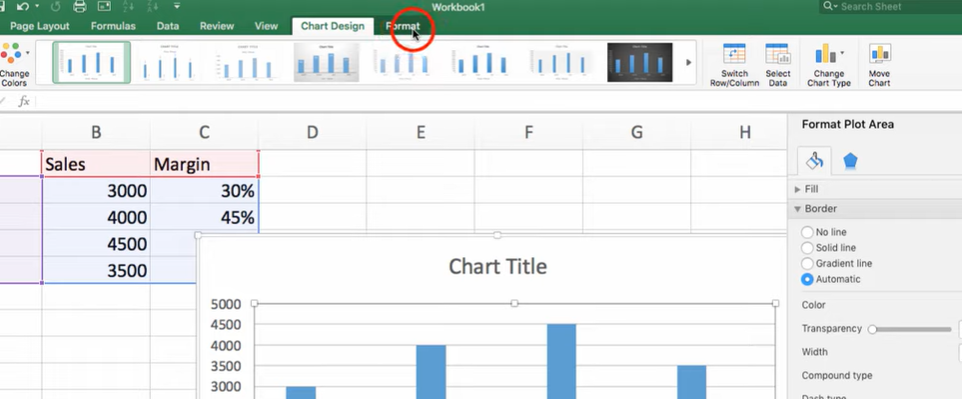
Formatting and Customizing Your Charts: combine 2 charts in excel
After creating your charts, the next step is to format and customize them. Luckily, Excel offers a wide range of formatting and customization options. You can check below examples.
- Changing the colors and fonts of your charts.
- Adding titles, labels and annotations to your charts.
- Adjusting the axis scales and labels to represent your data better.
- Adding trendlines, data markers and error bars to your charts.
You can also use Excel’s chart layout and style options. Or you may apply pre-designed formatting and customization options to your charts.
combined charts in excel: How to combine multiple charts in excel
Now, you can combine them using Excel’s chart tools. There are different ways to combine charts in Excel. Such as below.
- You can use Copy and Paste it onto the other chart.
- Using overlay, you can align one chart over the other and adjust the transparency or color of one chart to make it blend.
- Also, you can create a secondary axis for one chart and align it with the other to create a single chart.
Regardless of method, it is important to ensure that your combined chart is easy to read and understand. You can achieve this by below methods.
- You can use clear and concise labels and titles.
- Using contrasting colors to differentiate between data sets.
- Also choosing appropriate chart types to represent your data.
Best Practices on how to combine charts in excel
While combination charts are super useful, there are some best practices to keep in mind when using them.
- Firstly, you can use combination charts when you need to represent different dimensions of your data in a single chart.
- You should avoid combining too many chart types in a single chart tough. Because this can make the chart cluttered everywhere.
- Also you should create each chart type in the combination chart with its own data axis. So the scales of each chart type are appropriate for the data you present.
- And do not forget to use colors and formatting. So you can make it clear which chart type is good for each data series in the chart.
Examples of combination graph in excel
Here are some examples of combination charts to create in Excel.
Column Chart with Line Chart
A column chart with a line chart can show a comparison between two data series. For example, you can use this type of chart to show the sales and profits of a company over time.
Bar Chart with Scatter Chart
While a bar chart with a scatter chart can easily state the relationship between two data series. Here, you can use this to show the correlation between the age and income.
Customizing Your combo chart excel
One of the most powerful features of these is our ability to customize them. Here are some tips to help you create customized combination charts in Excel.
1. Choose the Right Chart Types
When creating a combination chart, you should find right chart types for your case. For example, if you are trying to compare two data sets with different values, you may use a combination of a bar chart and a line chart.
2. You can Use Custom Data Labels
In this chart type tough, you can add custom data labels to highlight some points. You can also use custom data labels so you can show some different information. For example, percentages or dollar amounts.
3. Add a Trendline
In case you or your team is trying to identify trends in your data, you can add a trendline to your combination chart. A trendline is a line and it shows the general direction of your data. So you can make it easier to find trends and patterns.
4. Modify the Chart’s Formatting
You can customize almost every aspect of your combination chart’s formatting. Such as chart’s color scheme, font size and axis labels. By modifying the chart’s formatting, you can make it easier to understand tough.
Conclusion
Combining two charts in Excel is a simple yet powerful tool and analyze your data. With correct chart types, formatting and customizing your charts and combining them, you can have a better visual for important decision making points. So next time you need to compare multiple data sets, you can try combining two charts in Excel and see how it can help you

A dedicated Career Coach, Agile Trainer and certified Senior Portfolio and Project Management Professional and writer holding a bachelor’s degree in Structural Engineering and over 20 years of professional experience in Professional Development / Career Coaching, Portfolio/Program/Project Management, Construction Management, and Business Development. She is the Content Manager of ProjectCubicle.