
What are Data Bars in Excel? In case you are having problems to visualize data in Excel and interpret complex spreadsheets, so data bars in Excel are your solution. They can create easy-to-understand visual representations of your data. Here tough, we will look at data bars in Excel. And you will learn topics like how to create them to how to customize them.
Table of Contents
What are Data Bars in Excel? how to insert data bars in excel
They are a conditional formatting option. And they can represent values using colored bars visually. The length of the bar is the value of the cell. Data bars can work on a single cell or a range of cells. Hence it is making them a practical tool.
- First, you will select cells you want to apply data bars.
- Then, you should click Conditional Formatting button in Home tab.
- It is time to select Data Bars from dropdown menu.
- Now, you choose the type of data bar you want to use. These can be solid fill, gradient fill or a different one.
- You can adjust the color and other formatting options as you like.
- In the end, you just click OK to apply the data bars to your cells.
how to add data bars in excel
Creating data bars in Excel is a straightforward process once you get the main point.
- You will always select the cells you want to apply this option.
- Then, you will click on Conditional Formatting option located in Home menu.
- Now, you select Data Bars from that drop-down menu.
- It is time to play with color and style of the data bars for your preference.
How to Customize Data Bars in Excel: data bar conditional formatting
Customizing data bars in Excel is good to create a more visually appealing and informative representation. You can customize them to your preference if you wanna get better visuals.
Change the Color of the Data Bars
To change the color of data bars in Excel, here are the steps to do it.
- As always, you first select the range of cells with data bars.
- Then, you click on Conditional Formatting.
- This time for customization, you will choose Manage Rules from drop-down menu.
- You will click on the rule you want to change.
- Now, you click on Fill tab.
- And voila, you can choose the color you want to use.
Change the Direction of Data Bars
In case you need to change the direction of data bars for better insight, you follow below steps.
- You will select the cells with data bars.
- Again, you go for Conditional Formatting within Home menu.
- You should choose Manage Rules like you did in how you wanna change colors.
- Then, you will click on the rule to change it.
- This time you should select Bar Direction.
- And simply, you will choose the direction you want to use.
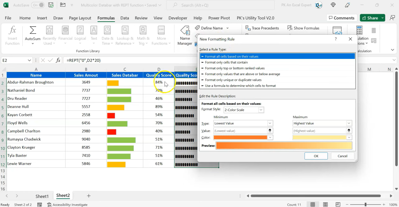
Change the Minimum and Maximum Values: excel bar chart in cell
- After selecting cells and going to conditional formatting, you will choose Manage rules under Home.
- Now, you can click on the rule to edit it.
- It says Edit Rule.
- You can change the minimum and maximum values here.
How to Use Data Bars in Excel
They are so great for visualizing data in Excel and you can apply them for many cases.
Identify Trends
Data bars can identify trends in your data. Visualizing the data lets you see patterns you can not immediately see in a messy sheet full of numbers.
Compare Data
Data bars makes comparing process simple. By looking at the length of the bars, you can quickly see which values are higher or lower.
Highlight Important Data
They can also highlight important data. When you are applying data bars to specific cells, you can draw attention to those cells for viewers. They are an excellent tool for visualizing data in Excel. They provide a graphical representation of the values for everyone in the room.
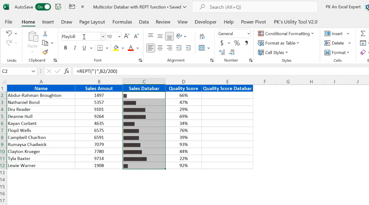
data bars on excel
They are basically conditional formatting option and they are adding a bar chart to cells. The length of the bar is the same value in the cell. So, longer bars are representing higher values.
Advanced Tips for Using Data Bars in Excel
Data bars can be customized to fit your specific needs and as well as for visual taste.
- You can Change the direction of the data bars: By default, data bars run from left to right. But you can change the direction to up-down or right-left.
- It is possible to apply data bars to negative values. These can help highlight areas where improvements are necessary.
- Also, you can combine data bars with other conditional formatting options here. Such as color scales or icons to create a complete visualization.
FAQ
Q: Is it possible to apply data bars to a pivot table in Excel?
A: Yeah for that you will Simply select cells in the pivot table and follow the same steps for creating data bars as usual.
Q: Can I apply multiple data bars to the same range of cells?
A: You can apply multiple data bars to the same cells. You should create multiple rules with different minimum and maximum values. As well as different colors.
Q: How to Apply data bars to negative values?
A: Automatically, Excel will use a solid fill for negative values and a gradient fill for positive values.
Conclusion
They can work magic for visualizing your boring or bland cells. Creating easy-to-understand visual representations can be helpful for identifying trends, compare data as well as highlight important information. Now here, you know almost everything about data bars in Excel. From how to create them to how to customize them.

A dedicated Career Coach, Agile Trainer and certified Senior Portfolio and Project Management Professional and writer holding a bachelor’s degree in Structural Engineering and over 20 years of professional experience in Professional Development / Career Coaching, Portfolio/Program/Project Management, Construction Management, and Business Development. She is the Content Manager of ProjectCubicle.