When Excel users want to create a clustered bar chart, they need to take a few extra steps before. Because these charts extend the bar chart to another level. Also, rather than just showing one category variable’s levels, they are doing it for two. For levels of a single categorical variable, you can group them by position. And the secondary category level within each group is indicated by color. In this blog post, we will show you how to create a one and provide some tips for common usage cases.
Table of Contents
How do you create a clustered bar chart in Excel?
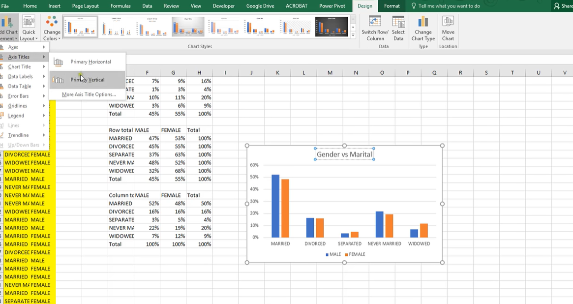
The first thing you need to do is select the data to include in your chart. Once you have your data, you will click on the Insert tab. And then, you can select the Clustered Bar chart type.
Your chart will now appear on your worksheet like sudden. You can add titles, labels and other information to your chart to make it more understandable.
Now that you know how to create one of them, let’s take a look at some tips on how you can use this type of chart to your advantage.
When should you use a clustered bar graph?
A clustered bar chart is quite useful to compare data sets in same category. But you should use different values for them. For example, you could use a clustered bar chart to compare the sales of two different products in the same month.
Another use is to compare data over time. Here, you could use it to track the sales of your product each month for the past year.
How can you make your clustered column chart excel more effective?
Here you should use colors to distinguish between the different data sets. Because when you are presenting them, people can follow them more easily.
how to make clustered bar chart in excel
These charts are also known as a grouped bar chart. Because this is a type of bar chart that shows data grouped by category. And these are useful for comparison purposes. Because they help you see how different groups of data compare to each other.
how to create clustered bar chart in excel
When creating a clustered bar chart, it is important to determine purpose of the chart. Clustered bar charts are best used for comparisons. So you can use a data with comparable features. Also, we recommend to use clear and concise data labels. Hence, you will ensure your audience can easily understand the information in the chart.
What is a chart in Excel?
A clustered chart shows data grouped by category. In essence, these are useful for comparison purposes mostly.
Clustered bar charts are best used when looking at two or more categories of data. For example, if you use them to look at two products side-by-side, this chart type is ideal. The are also useful for seeing whether one category outperforms another.
When is a grouped bar chart appropriate to use?
The grouped bar chart will display a distribution of data points. Or, it can help you to make comparisons between various data categories. Much like a regular bar chart. The split of data points among two distinct category variables is where the grouped bar chart may change.
When you need to examine how the second category variable varies within each level of the first, you can use a grouped bar chart. Also, if you want to examine the variations in the first category variable between the second’s levels, they are good to go too.
The categorical variables’ order
Selecting which of the two category factors will be the primary variable. Because it will be dictating the axis positions for each bar cluster. And this will be the secondary variable for telling the number of bars to plot in each cluster. Hence, it is a crucial step in generating a grouped bar chart. Which categorical variable is more significant as the main variable may be determined using domain knowledge and details about the kind of categorical variables.
For example, monthly summaries 20XX-Jan, 20XX-Feb, 20XX-Mar, etc. are examples of categorical variables. Because they illustrate temporal data. Also, they are typically a clear option for the principal category.
Sustain a baseline of zero
Here, bar chart should have a zero-baseline. And other variables should not affect it by the inclusion of clustered bars. Bar lengths are accurate to the values they convey when there is a baseline. Just as there was in the original chart.
Category level ordering
With a slight modification on how “largest” to “smallest”, the general rule of ranking bars from largest to smallest. Of course, unless they have an intrinsic ordering also applies to clustered bar charts. Each categorical variable should be evaluated separately. We should not regard to the divisions of any other relevant categorical variable.
Selecting colors that work for your charts
While it was common practice to maintain all bars in a traditional bar chart with the same color, with grouped bar charts, color selection becomes essential. Because they are ideal to differentiating levels of the secondary category variable. Selecting a color scheme with the kind of secondary variable you have is important. Such as qualitative palette for strictly categorical variables. Or having a sequential or divergent palette for categorical variables for simple ordering. Since they are bunch of chart together, this is crucial in telling what you meant.

A dedicated Career Coach, Agile Trainer and certified Senior Portfolio and Project Management Professional and writer holding a bachelor’s degree in Structural Engineering and over 20 years of professional experience in Professional Development / Career Coaching, Portfolio/Program/Project Management, Construction Management, and Business Development. She is the Content Manager of ProjectCubicle.