![Power Bi Slicers Complete Guide Best Practices [2024]](https://www.projectcubicle.com/wp-content/uploads/2024/03/Power-BI-Slicers-Complete-Guide-Best-Practices-2024.png.webp)
When you integrate Power BI slicers into dashboards, it does much more than simply filter data. Because they enhance the dashboard’s utility and aesthetics. The strategic placement and customization of slicers transform static data into interactive stories.
Table of Contents
What is a slicer in Power BI?
For example, you can consider a sales dashboard to display performance metrics across different regions. When you add a geographic slicer, users can easily select their area of interest. This saves time but also it makes the dashboard more useful. Beyond functionality, slicers can be styled for user experience.
What are slicers in Power BI?
Custom Slicers in Power BI take the concept of slicers a step further with a higher degree of personalization and interactivity. Unlike standard slicers, custom slicers can be fit the specific aesthetic and functional requirements of your dashboard. For instance, you might use custom icons for slicer buttons, apply unique color themes or even design slicers that leverage custom visuals from the Power BI Visuals Marketplace.
Power BI Slicer Techniques
One such technique is the use of slicer panels. This can be expanded or collapsed. Another advanced technique involves connecting slicers to multiple visuals across different pages of a report.
A particularly useful technique is the implementation of cross-report slicers. Because it maintains filter contexts across different reports within a Power BI workspace. This is especially beneficial if you are working with multiple reports and wish to maintain a consistent analytical view across them. Advanced DAX formulas and creative layout designs can help in achieving these functions.
Interactive Reports with Power BI Slicers
Creating interactive reports with Power BI slicers transforms static data visualizations into dynamic tools for insights and analysis. By integrating slicers, you empower users to interact with the data directly, tailoring the information to meet their specific needs. This not only enhances the user experience but also promotes deeper engagement with the data.
Step 1: Understand Your Audience
Before adding slicers, you should consider what your audience needs from the report. Understanding their requirements helps you decide.
Step 2: Add Slicers to Your Report
To add a slicer:
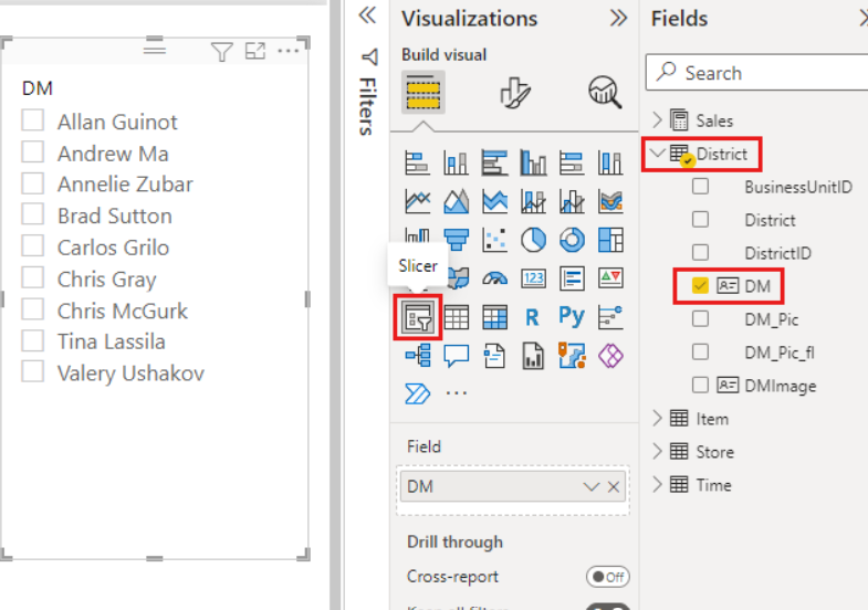
- In Power BI Desktop, you should select the Slicer icon from the Visualizations pane.
- Now, you can choose a field that your audience might want to use to filter the data. And drag it into the slicer.
Step 3: Customize the Slicer
Customizing slicers to fit the report’s theme and the audience’s needs is crucial.
- It is possible to change the slicer’s orientation from vertical to horizontal.
- You can adjust the slicer’s size and colors to match the report’s design.
- Also, you may convert the slicer to a dropdown to save space.
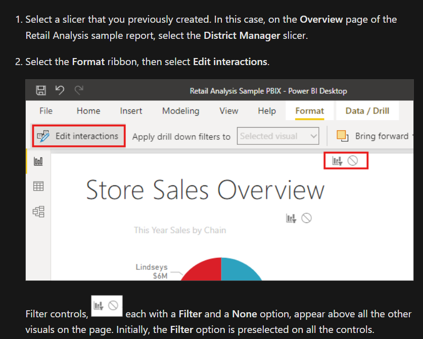
Step 4: Enable Slicer Interactions
Power BI allows you to control how slicers interact with other report elements. When you create slicer interactions, you can specify which visuals update based on the slicer selections.
Step 5: Use Advanced Slicer Options
For more complex scenarios, you may consider using advanced slicer options such as below.
- Date Slicers: They offer a range selection for date fields. So you can filter data within specific periods.
- Hierarchy Slicers: They are useful to drill down through data hierarchies.
Step 6: Test and Iterate
After integrating slicers, you should test the report’s interactivity. Also, you can gather feedback from a sample of your audience.
Best Practices for Interactive Reports with Power BI Slicers
- Too many slicers can overwhelm users and slow down the report. Only include slicers that add value to the data exploration process.
- For reports requiring multiple slicers, you should group them logically.
- Adding tooltips to slicers can guide users on how to use them.
Slicer Filters in Power BI
Slicer filters in Power BI are useful for effective data manipulation. So the users can focus on relevant data. For optimal slicer application, it is vital to understand their impact on data load and rendering.
Choosing fields for slicing with an eye on their cardinality and data model relationships is key. High cardinality fields might slow down performance. Strategies to mitigate this include using slicer hierarchies, slicer caching or designing reports to avoid high-cardinality fields.

A dedicated Career Coach, Agile Trainer and certified Senior Portfolio and Project Management Professional and writer holding a bachelor’s degree in Structural Engineering and over 20 years of professional experience in Professional Development / Career Coaching, Portfolio/Program/Project Management, Construction Management, and Business Development. She is the Content Manager of ProjectCubicle.