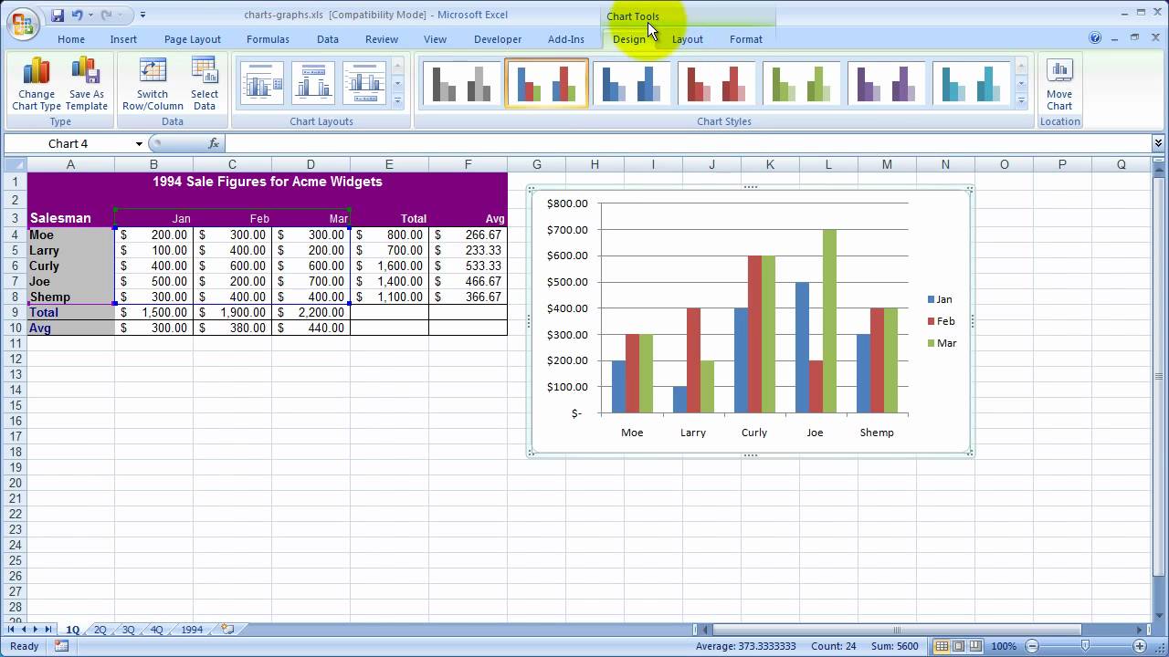
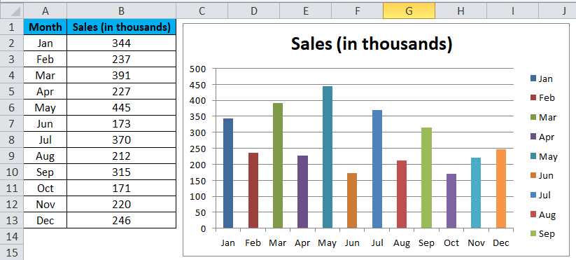
A column chart in Excel works with a data point. And it is represented by a vertical line. Columns can compare data points and track changes over time. The height of the column indicates the value of the data point. You can use columns to create bar charts, line graphs, or scatter plots. Let’s look at how to create a column chart in Excel.
Table of Contents
column chart excel vs column graph excel
Charts are a great way to visualize data. In this type of chart, data is displayed in rows and columns. A column is the vertical part of the chart. And it displays information about one category or item. Columns are usually go from left to right. Here the first column on the left containing the smallest values. While the last column on the right containing the largest values.
How do I make a column graph on Excel?
Column charts can compare data points and track changes over time. The height of the column indicates the value of the data point. Column charts can create bar charts, line graphs or scatter plots.
How to draw a column graph?
To create a column chart in Excel, you can select the data you want to use for chart content. Then, you will click on Insert tab and choose Column. In the menu, you will see different options for creating a column chart. Here, you can select the type of column chart you want to create.
After selecting the type of column chart you will need to choose how many columns you want to use. You can use up to 12 columns in one chart tough. Once you selected the number of columns, the chart will be inserted into your worksheet automatically.
Customizing Your Chart
Once you have inserted your creation, you can customize it for better visuals. For example, you can change the color of the columns, add data labels or change the axis labels. Please see our tutorial on How to Customize Column Charts in Excel to learn more about how to customize your column chart.
What is in a column graph? Examples
Column charts are a type of graph essentially. And they can compare data points in Excel. Column charts can also track changes over time. Or you can use to compare something side-by-side. Also, column charts are a good choice when you have data with multiple categories. So you can see differences in one visual.
How do column charts work?
- To see the sales of different products over time
- For comparing performance of different teams in a department or company
- For looking at percentage of people who responded positively to different surveys
What are bar charts in a spreadsheet?
Bar and column charts are two of the most commonly used types of charts in spreadsheets. They are both used to visually represent data. But like any tables or formats, there are some key differences between them.
Column Chart in excel Use Cases
Bar charts are typically compare data across different categories. While column charts are more ideal to compare data over time. Column charts are also good at comparing data across different categories. But they are not as common for this purpose.
Moreover, bar charts are easy to interpret because they use horizontal and vertical axes. Column charts can be more difficult to interpret. Because they use a vertical axis and a horizontal axis.
Also, they are best in use when you have categorical data ready at hand.
Changing Style and Colors
For playing with style a bit, you can choose Shape Effects from the Format tab. After that, you will choose a suboption after selecting an option like Bevel or Glow to apply various shape effects.
If you wanna try a theme, you can select Themes from the Page Layout menu and pick a theme.
In order to play with format, you can choose a component from the Chart Elements dropdown box. Then, you will click Format Selection.
Now you can make adjustments to apply a formatting choice for chart element such as the Vertical (Value) Axis, Horizontal (Category) Axis and Chart Area to mention a few. For every component you wish to change, use the same procedure.
Why are column chart in Excel so helpful?
- Making column charts is easy. A column chart only requires a few clicks to make.
- Compared to several other chart formats, column charts are more recognizable to users. They are therefore a reasonable choice since you want people to understand information you are providing.
- With column charts, there are an enormous variety of formatting possibilities available.
- Advanced features like trendlines and adding a secondary axis are not accessible with certain other chart styles. But column charts do.
- They are quite flexible and can analyze data, visualize goal progress. Or they can easily determine percentage contributions and compare real data to planned situations.
How to Include and exclude elements from a column chart?
One of a column chart’s advantages is in spite of its simplicity, it offers a wide range of alternatives.
These comprise the quantity of items. So you may add to or subtract from single units from column chart.
- First, you should take a look at taking the principal vertical axis (value axis). As well as the gridlines off of the chart.
- To accomplish remove an elemen from your chart, you might choose the element and hit the keyboard’s Delete key. In this way, you can have different versions of your chart to make a point.

A dedicated Career Coach, Agile Trainer and certified Senior Portfolio and Project Management Professional and writer holding a bachelor’s degree in Structural Engineering and over 20 years of professional experience in Professional Development / Career Coaching, Portfolio/Program/Project Management, Construction Management, and Business Development. She is the Content Manager of ProjectCubicle.


