
So in case you are wandering around Excel charts and you need a chart type to highlight some trend or info? Yes you can do it by a box and whisker plot in Excel? Because in essence, a box and whisker plot is a super handy and cool way to visualize your data. It is ideal for showing you the spread and highlighting any outliers.
Table of Contents
In this chat, we will walk you through how to create one using the data analysis toolkit. Creating a box and whisker plot is pretty simple and clean. If you choose and prepare a suitable data format, then making those eye-catching plots will be a lot easier.
What is the Box and Whisker Plot in Excel?
Creating a box and whisker plot in Excel is easy! But you should just follow these simple steps as below.
- First of all, always start with selecting your data. You can do this by clicking on the cells you want to include in your chart.
- Now it is time to go to Insert and then click Charts menu to see them all.
- From upcoming menu, you will select Box and Whisker obviously.
- And voila, your box and whisker plot will appear. So now, you can customize it however you want and select the most beautiful one for your presentation.
And yes, that is quite easy like adding other charts in Excel. Now let’s walk through an example, so that you can see how it works.
Box and Whisker Plot in Excel Example
Ok, let’s suppose we have the following data set:
1, 2, 3, 4, 5, 6, 7, 8, 9
To create a chart from this data set in Excel, we follow these steps below.
- We select the cells that contain our data. In this case, those cells are A1 through A9.
- And then, we will click the Insert tab and then Charts.
- In next menu, we should select Box and Whisker.
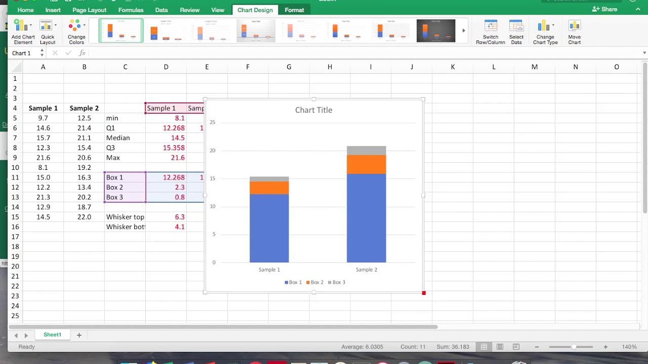
- Yep, now our box and whisker plot appears like this.
As you can see, creating a box and whisker plot in Excel is easy! You can use this technique to visualize your data sets. Thus, it can help to make better decisions about your data. If you have any questions, feel free to post them in the comments section below.
What is a box and whisker plot in Excel?
A box and whisker plot is a type of graph showing the data distribution. It is a handy way to visualize your data and it is easy to do. In this tutorial, we showed you how to create it in Excel in just 4 moves. We also walked you through an example to see it working.
How to create a box and whisker chart excel in Excel
There are a few different ways to create it in Excel. Here tough, we will show you two easy methods using the built-in features of Excel.
Method 1: how to make a box and whisker plot using the Built-in Function
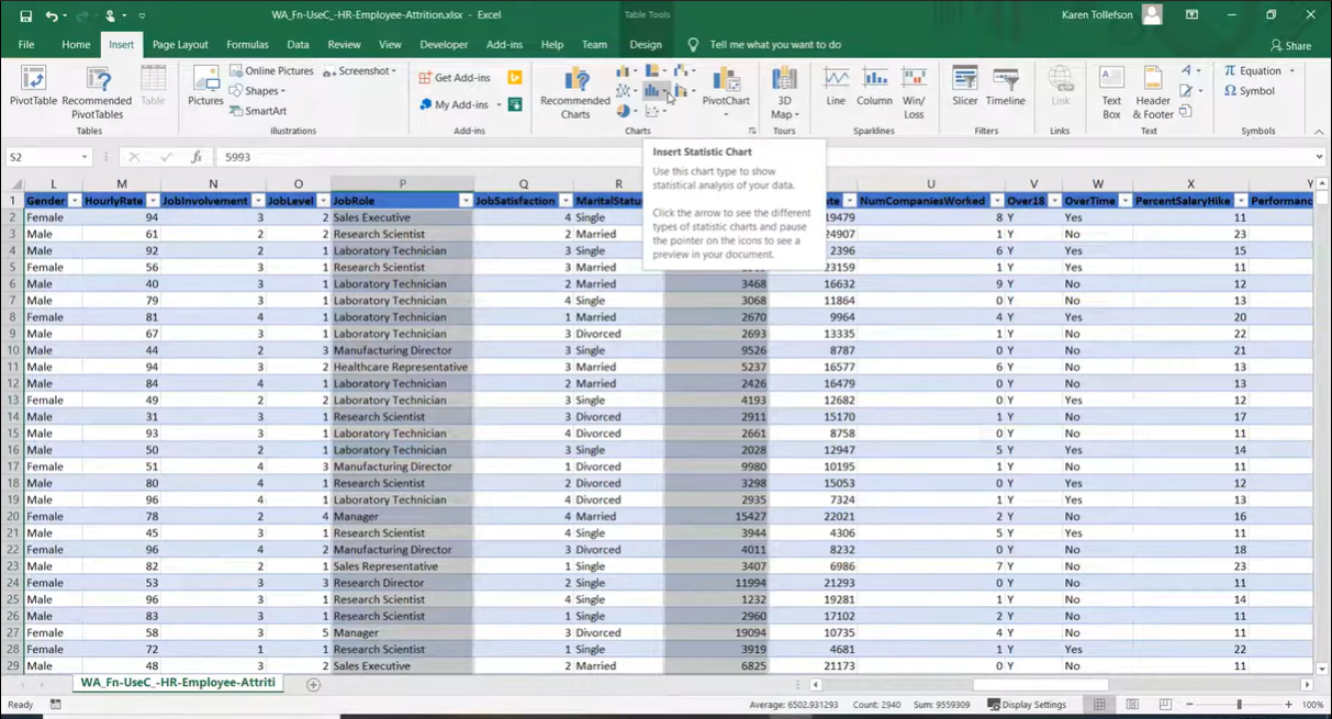
Excel has a built-in function to create a Box and Whisker Plot. If you wanna use this method for excel box and whisker, you can follow below steps.
- Firstly, as always, you should choose your data. And you should include the labels in the first row and the actual data points in the rows below.
- Now you can go to the Insert tab and click on the Statistic Chart icon.
- From the chart options, you should pick Box and Whisker.
- And last move is to Hit OK and your chart will pop up!
Method 2: Box and Whisker Plot using the Analysis ToolPak
If you don’t see the Statistic Chart icon on the Insert tab, you can use the Analysis ToolPak to create a Box and Whisker Plot. The Analysis ToolPak is an Excel add-in that comes with Office. But it is not enabled by default. To enable it you should download and set it up in your Excel program.
- First you should go to File > Options.
- And in the left, you should select Add-Ins.
- Now in Manage drop down, you should go and select COM Add-Ins and click Go.
- You can check the box next to Analysis ToolPak and click OK.
- Ok, once you activate Analysis ToolPak, you can use it to create a Box and Whisker Plot.
- Now it is time to select your data for upcoming chart. Here, you should include the labels in the first row and the data points in the subsequent rows.
- So now, you go to Data option and then click the Data Analysis icon.
- In the Analysis Tools list, you should select Box and Whisker and click ok.
Both of these methods will give you a basic Box and Whisker Plot. If you want to customize your plot more tough, you can right-click on the chart and select Format Chart Area. You can change the colors, add or remove elements and play with how it looks.
graph box and whisker Uses for in Excel
Creating it in Excel is handy yet cool way visualize your data. With just a few clicks, you can create a visually appealing chart. And also it can help you see trends and patterns. So, it is time for you to practice and apply it.
- This type of chart is ideal for finding outliers.
- Also you can create a box and whisker plot when visualizing distributions.
- You can be comparing groups of data.
- Or you can use it for determining central tendency (median).
This article is a guide on How to break a link in Excel. You may learn more about Excel from the following articles as well.
Easy Excel! How to Create Barcode in Excel? – projectcubicle

A dedicated Career Coach, Agile Trainer and certified Senior Portfolio and Project Management Professional and writer holding a bachelor’s degree in Structural Engineering and over 20 years of professional experience in Professional Development / Career Coaching, Portfolio/Program/Project Management, Construction Management, and Business Development. She is the Content Manager of ProjectCubicle.